

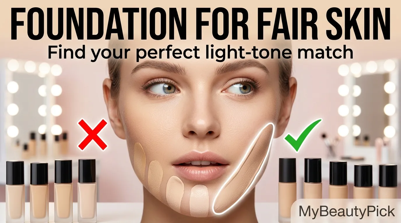
Why Fair and Pale Skin Is Uniquely Hard to Match
Foundation matching is a two-variable problem: depth (how light or dark) and undertone (the underlying hue). For medium and deep skin tones, there is enough melanin in the skin that the depth variable is the dominant issue — a shade that is half a step off reads clearly wrong. For pale and fair skin, the dynamic reverses. Because very fair skin has so little melanin, it cannot absorb or blend a mismatched foundation the way that medium or deep skin can. A foundation that is half a shade too dark creates an obvious mask effect with a visible jawline.
This low melanin concentration also means undertone errors are more visible on pale skin, not less. There is nothing in the skin to diffuse or absorb a mismatched undertone. If the foundation is too warm, it sits as an orange or yellow cast on a visibly pale base. If it is too cool, it reads chalky, grey, or even faintly lavender. The margin for undertone error on pale skin is narrower than at any other depth — which explains why so many people with fair complexions find foundation shopping genuinely harder than those with medium tones, even though they represent the market that most mainstream formulas were historically designed for.
The Undertone Problem at the Pale End of the Range
The subtleties of undertones — those hints of yellow or pink that make a foundation tone look genuinely skin-like — tend to be lost once you get into the porcelain and ivory end of a foundation’s shade offering. Many brands develop their shade range from the medium end outward, adding lighter shades by increasing titanium dioxide and reducing warm pigments. The result is a pale shade that looks approximately fair but lacks the nuanced undertone balance that the same brand achieves in its medium shades. This is the structural reason why fair skin is underserved even by brands with an apparent pale range.
The Core Rule for Pale Skin Foundation Matching
The most common mistake on pale skin is choosing a foundation slightly too dark, believing it will make the skin look less pale. This always backfires — a foundation slightly too dark on pale skin looks like a muddy mask, not natural colour. The correct approach is to match your exact skin tone accurately and use blush, bronzer, and highlighter to add warmth and dimension. Your foundation’s job is to disappear into your skin, not to add colour to it.
Understanding Undertones in Fair Skin
Fair skin can carry cool, warm, neutral, or olive undertones — and the correct foundation direction is entirely different for each. Understanding which category you are in is the most important step before any product selection.
How to identify your undertone as a fair-skinned person
Cool-undertone pale skin has a pink, rosy, or occasionally bluish cast. Veins appear blue or purple. Silver jewellery complements the skin more than gold. Skin burns easily and rarely tans — it either stays pale or goes straight to pink.
- Foundation direction: pink-neutral or rosy-based pale shades
- Shade descriptors to look for: “Cool”, “Porcelain Cool”, “Ivory Rose”, “C1”
- What to avoid: yellow or golden bases that add warmth the skin does not have
- Biggest mistake: using a warm ivory and wondering why the skin looks sallow
Warm-undertone pale skin has a subtle golden, peachy, or yellow quality. Despite being fair, it has a warmth that is visible in natural light. Veins appear green. Gold jewellery looks more harmonious than silver. May tan slightly and rarely burns severely.
- Foundation direction: ivory or pale shades with a yellow or peach base
- Shade descriptors to look for: “Warm”, “Ivory W”, “Golden Ivory”, “W1”, “1W”
- What to avoid: pink-based foundations that cancel out the skin’s natural warmth
- Biggest mistake: reaching for a cool pink shade because it “looks fair” in the bottle
Neutral pale skin sits between warm and cool — no single undertone dominates. Veins appear blue-green or teal. Both gold and silver jewellery look equally well. The most forgiving undertone for foundation matching because there is more tolerance for slight warmth or coolness.
- Foundation direction: neutral pale or porcelain shades with no dominant hue
- Shade descriptors to look for: “Neutral”, “N1”, “Porcelain”, “Alabaster”, “Ivory N”
- What to avoid: heavily warm or heavily cool shades at either extreme
- Biggest mistake: choosing the very lightest shade available without checking undertone direction
Olive undertone at fair depth is less common but frequently misidentified. The skin has a subtle grey-green muted quality rather than warm golden or cool pink. Not everyone with a Mediterranean or East Asian background has olive undertone, but it is more common in these backgrounds.
- Foundation direction: neutral with a very slight grey-green offset — avoid purely pink or purely golden bases
- Shade descriptors to look for: “Olive N”, “Neutral Cool”, shades described as suitable for olive complexions
- What to avoid: high-pink or high-golden foundations that clash with the olive quality
- Biggest mistake: defaulting to a warm ivory because it is pale when the skin needs a cooler neutral
The Shade Families for Fair and Pale Skin — What the Names Mean
Shade names across the beauty industry are inconsistent and not standardised. “Porcelain” in one brand may be a cool-toned pale — in another it is a neutral pale. Understanding the general shade families that appear in the palest range helps filter options before swatching.
The four shade families at the pale end of any foundation range
The lightest tier in most ranges. Often neutral or very slightly cool. The most universally flattering family for pale skin because it avoids committing strongly to warm or cool. Works best for neutral and cool-neutral undertones. Can read chalky on warm-undertone pale skin if the formula is overly white.
Pale shades with a yellow or peach base. The correct family for warm-undertone fair skin — without it, the skin’s natural warmth has nothing to anchor to and the foundation reads cold. Look for shade descriptors like “warm,” “yellow-undertone,” “golden,” or “W1” in a brand’s system. Can look orange or overly warm on cool-undertone pale skin.
Pale shades with a pink or rosy base. Correct for cool-undertone pale skin where the skin’s natural pink quality is complemented rather than suppressed. On warm or neutral-undertone pale skin, these read as ashy, grey, or chalky — the pink foundation cool against the skin’s warm base creates a visible colour conflict.
For the very palest skin — so fair that most “light” shades read as medium — translucent or ultra-fair shade families are essential. Often sold as “00” or “0.5” to indicate they go lighter than the standard range. They have minimal pigment density, allowing the skin’s natural translucency to show through. These require sheer-to-medium, luminous formulas to work correctly.
The Specific Problems Pale Skin Faces With Foundation
Oxidation — The Orange Shift After Application
Foundation oxidation means it might look perfect at first, but then within ten minutes of wear it has gone a little bit orange or yellow and just looks unwell, or like it is totally not a match for the skin tone. On pale skin, oxidation is highly visible precisely because there is no melanin to blend or absorb the colour shift. An iron oxide pigment that drifts warm on medium skin looks like a slight deepening. On pale skin, the same drift looks like an orange mask on a visibly pale base — the contrast is immediately obvious.
The oxidation test for pale skin needs a longer window than for other skin types. Apply a swatch to the jawline and wait at least 30 minutes — ideally 60 — before assessing the match. Look for products labelled “non-oxidizing” or “true-to-tone,” and use oil-free moisturisers underneath to reduce the lipid environment that accelerates oxidation.
Flashback — The White Cast in Photographs
On very pale skin, even a small amount of white mineral SPF can make the foundation look grey or chalky in photographs. Flashback is caused by ingredients like titanium dioxide and silica — high-SPF products and silica-heavy powders leave a white cast in flash photography. This is a compound problem for pale skin: the very ingredients that create white cast in photos — titanium dioxide, zinc oxide, silica — are also the ones most commonly used in the lightest foundation shades to achieve pale pigmentation. A fair foundation with high mineral SPF is therefore doubly problematic in photography: the pale formulation already has reflective white particles for depth, and the mineral SPF adds a further reflective layer on top.
The solution is to separate SPF from foundation. Apply a chemical SPF moisturiser as the skincare step, then use a foundation with no mineral SPF or no SPF at all. The sun protection is in the skincare layer; the foundation is free to be formulated without the reflective particles that cause flashback.
The Going-Too-Dark Trap
A common mistake on pale skin is choosing a foundation that is slightly too dark in an attempt to avoid looking washed out. This always backfires — a foundation that is slightly too dark on pale skin looks like a muddy mask, not skin with more colour. The correct approach is to match the exact skin tone and use blush, bronzer, and highlighter to add dimension. This is counterintuitive but fundamental: foundation’s job at pale depths is to disappear into the skin, not to change it. Any visible foundation on fair skin reads as product rather than skin. Warmth, depth, and dimension come from colour products — blush, bronzer, eyeshadow — not from choosing a deeper foundation shade.
The Finish Problem — Why Matte Fails Fair Skin
Full-coverage matte foundations can make very pale skin look flat, dull, and mask-like because they eliminate the natural translucency that is one of the most beautiful qualities of a fair complexion. A satin or luminous finish preserves the light-reflecting quality of pale skin. Matte formulas are appropriate for oily pale skin where sebum control is a genuine need, but applied all over on normal-to-dry fair skin, full matte coverage suppresses the natural light quality that makes pale complexions distinctive and luminous. Sheer-to-medium coverage in a satin or luminous finish, with full coverage used only for spot concealing, is the correct approach for most pale skin types.
The Pink-vs-Yellow Undertone Conflict
Finding foundation for pale skin with warm undertones has historically been a challenge — many formulas skew too pink, too chalky, or miss the mark entirely. As someone with pale skin and a distinctly yellow undertone, navigating foundations that do not fit is a persistent issue. The pink-vs-yellow problem is most acute at the very pale end because many brands historically associated pale skin with cool (pink) undertones, formulating their lightest shades with pink bases as a default. Warm pale skin — yellow-undertone Fitzpatrick I or II — is significantly underserved compared to cool pale skin, even now.
The test for this is simple: hold a warm ivory shade and a cool porcelain shade against your inner wrist in natural daylight. The one that seems to disappear against your skin and requires you to squint to see where the shade ends and the skin begins is your undertone direction. The one that looks like a visible layer against your skin — however close in depth — has the wrong undertone.
How to Shade-Match Foundation for Pale Skin — The Correct Process
Where to Swatch
Never swatch foundation for pale skin on the back of the hand or inner wrist. The skin on the back of the hand is often a different tone and undertone from the face — particularly for people who spend time outdoors, where the hands receive sun exposure at a different angle and rate than the face. The inner wrist is even less representative, as it is one of the palest areas of the body and may be several shades lighter than the face. Apply foundation to the jawline and blend onto the neck to ensure the shade disappears at the jaw. Assess in natural daylight.
The Natural Daylight Rule
Always test foundation shades in natural daylight to get the most accurate representation. Store lighting can be misleading and may cause you to choose a shade that is too light or too dark. Fluorescent store lighting flattens undertone differences, making a pink-based shade and a yellow-based shade look much more similar than they will appear outdoors. Natural daylight reveals the true colour relationship between the foundation and the skin’s undertone, including any orange, pink, or ashy cast that the artificial light conceals.
The Oxidation Wait
Apply the test shade to the jawline and step outside. Do not assess the match immediately — this is when the shade looks most accurate. Instead, wait 30 to 60 minutes and then reassess. For pale skin, the oxidation window is more critical than for medium skin because the colour shift is more visible. A shade that passes the initial application test but fails the 30-minute check has an oxidation problem — not a depth problem. Adjust by either trying the same brand’s next-lightest shade in the same undertone, or looking for formulas described as non-oxidising or long-wear true-tone.
The Neck Match Rule
The cardinal sin of pale skin foundation is choosing a shade that is darker than the skin on the neck and chest. Your foundation should match the skin on your neck, not the skin on the back of a tanned hand. This applies specifically to pale skin: the neck on fair-complexioned people is often genuinely lighter than the face, where sun exposure, redness, and slight natural warmth create a marginally deeper tone. Matching to the neck rather than the face creates a formula that disappears at the jaw rather than ending at it as a visible line.
Formula Considerations for Different Fair Skin Types
| Skin Type | Formula to Choose | Formula to Avoid | Coverage Approach |
|---|---|---|---|
| Dry fair skin | Hydrating liquid, serum foundation, or skin tint with luminous finish. Look for hyaluronic acid, glycerin, squalane. | Matte or long-wear formulas — these cling to dry patches and emphasise dehydration lines | Sheer-to-medium all over; concealer spot-applied over dry areas to avoid lifting |
| Oily fair skin | Water-based, oil-free formula with matte or satin finish. Niacinamide inclusion helps regulate sebum. | Serum or oil-infused foundations — accelerate breakdown on oily fair skin and worsen oxidation | Medium-to-full with setting powder in T-zone; blot before powder touch-ups |
| Combination fair skin | Satin-finish fluid formula that is neither heavily mattifying nor heavily luminous — balances both zones | Very dewy formulas that worsen the oily zone; full matte that flattens the drier cheek zone | Medium coverage, spot-concealed; mattify T-zone with light powder only |
| Sensitive or rosacea-prone fair skin | Fragrance-free, alcohol-free, gel-liquid formula with soothing actives. Green colour corrector before foundation. | Any formula with fragrance, denatured alcohol, or high mineral SPF — all are rosacea triggers | Medium buildable over green corrector; mineral powder finish optional |
| Extremely pale / Fitzpatrick I | Ultra-fair or 00-range shades in luminous or satin finish. Minimal pigment density, skin-like finish. Test oxidation rigorously. | Any shade labelled “light” that is positioned mid-range — these will read as medium on very pale skin. Full matte finish. | Sheer-to-medium; let the skin’s natural translucency show |
| Fair skin with freckles | Sheer-to-medium buildable formula that lets freckles show through. Skin tint or tinted moisturiser in the correct undertone. | Full-coverage formulas that erase freckles entirely — reads as obviously heavy on freckled pale skin | Even-out without covering; spot-conceal discolouration only |
The Best Foundations for Fair and Pale Skin
Assessed on undertone accuracy at pale depth, oxidation stability, formula quality, and shade range breadth at the fair end
Estée Lauder Double Wear Stay-in-Place Makeup
Estée Lauder — Best for Long-Wear, Very Fair Shades
Double Wear has one of the most reliable ranges for very fair shades with a spectrum of undertones, including options as light as 0N1 Alabaster and 1N0 Porcelain. Its shade system is one of the most developed at the pale end of any foundation range — the number prefix (0, 1, 1.5) indicates depth below the standard range, and the letter suffix (N, C, W) specifies undertone direction clearly. This makes it one of the most navigable systems for fair skin because the undertone labelling is explicit rather than hidden behind poetic shade names.
Medium to full coverage with a natural matte finish that resists fading, sweat, and oil breakthrough. The pigment balance leans true to tone, so if you match in-store you can expect minimal colour shift — and there is no significant mineral SPF in the current US formula, which helps it photograph well without flashback. The texture is thin but highly pigmented, making it efficient for coverage without thickness.
The limitation is the matte finish — on dry or mature fair skin, this formula can look flat and cling to texture. Best for oily to combination pale skin. For dry fair skin, a hydrating primer underneath is non-negotiable with this formula.
Finish: Natural matte
Lightest shades: 0N1, 1N0
SPF: None (US)
Best for: Oily–combination pale skin
NARS Light Reflecting Foundation
NARS — Best Natural Finish for Neutral-to-Cool Fair Skin
NARS is consistent in very fair shades like Mont Blanc and Gobi, which suit neutral to slightly cool or slightly warm undertones without pulling orange. This gives a natural, softly radiant finish that looks like real skin, not a mask. Coverage is a solid medium, buildable to more where needed. It balances redness well without erasing freckles, which many fair readers prefer. The satin-radiant finish is one of the most appropriate for pale skin specifically — it preserves the natural light-reflecting translucency of a fair complexion rather than flattening it.
Wear time is 8 to 10 hours with light powder, and it layers beautifully over sunscreen with minimal pilling. The lightweight silicone emulsion with skincare-style humectants feels flexible and comfortable. No sunscreen in the formula, which keeps flashback low. For pale skin that needs to photograph cleanly across different lighting conditions, the absence of mineral SPF is a genuine functional advantage.
Finish: Satin-radiant
Key shades: Mont Blanc, Gobi, Deauville
SPF: None
Best for: Normal–dry pale skin, photography
Giorgio Armani Luminous Silk Foundation
Armani Beauty — Best Luminous Finish for Dry-to-Combination Fair Skin
The Luminous Silk is consistently cited across professional and editor recommendations as one of the best foundations for dry-to-combination fair skin, and its shade range at the pale end is one of the most undertone-nuanced in the premium segment. The micro-fil technology diffuses light across the skin surface without creating obvious shimmer, giving the naturally translucent quality of pale skin a refined, luminous finish rather than a flat or reflective one. Shades 1, 2, and 3 cover the fair to light-fair range with multiple undertone options per depth.
The coverage is medium and genuinely skin-like — it evens the complexion without covering texture or freckles completely. For pale skin where over-coverage creates an obvious painted look, this level of coverage in a luminous finish hits the correct balance. The formula is also reliably non-oxidising, which is a meaningful advantage for pale skin where colour shift is so visible.
Finish: Luminous
SPF: None
Best for: Dry–combination fair skin, anti-mask finish
Price: Premium
Haus Labs Triclone Skin Tech Foundation
Haus Labs — Best for Warm-Undertone Pale Skin
Haus Labs Triclone works perfectly for pale skin with warm undertones — staying true to colour and never oxidising. It offers buildable coverage that even when layered does not feel heavy or mask-like, keeping skin looking fresh and natural. Shade 030 Fair Cool is a frequently cited starting point, but the range includes multiple fair shades with distinct undertone directions.
The fermented arnica in the formula provides an active redness-reducing benefit alongside the coverage — relevant for fair skin that tends to show redness more visibly than any other depth. The 51-shade range includes some of the most precisely differentiated options at the very light end. For warm pale skin specifically — a historically underserved undertone in the fair range — the warm ivory options here are among the most accurately formulated available.
Finish: Natural
Shades: 51 total
SPF: None
Best for: Warm-undertone pale skin, redness-prone fair skin
L’Oréal Paris True Match Super-Blendable Foundation
L’Oréal — Best Affordable Option with Clear Undertone Labelling
L’Oréal Paris True Match is praised for its affordability and features a wide range of undertones with a smooth finish. For a high street foundation, the shade range is impressive — 48 shades total, recently reformulated with green and blue colour pigments for even more skin-like tones. The True Match system uses an explicit W (warm), N (neutral), and C (cool) suffix on every shade, making undertone identification simple at point of purchase — no guessing from a poetic shade name. Shade 1W has just the right amount of yellow for warm-undertone pale skin without veering into sallow territory.
The formula is lightweight and buildable from light to medium coverage. For fair skin, it performs reliably without oxidising significantly and the undertone range at the light end is one of the best available at drugstore price. The limitation is that the very lightest depth (1W, 1N, 1C) is still positioned as “fair” rather than extremely pale — for Fitzpatrick Type I skin, this may still read slightly darker than ideal.
Finish: Natural dewy
Shades: 48
Price: Drugstore
Best for: All fair skin types seeking affordable option with clear undertone system
Fenty Beauty Soft’Lit Naturally Luminous Longwear Foundation
Fenty Beauty — Best for Fair Skin That Wants a Radiant, Fresh Finish
Fenty Beauty built its reputation on shade inclusion at the deep end, but its light range is now genuinely competitive. The Soft’Lit formula is one of the most skin-like at the fair depth — the luminous finish reads as natural glow rather than shimmer, and the coverage is medium enough to even the complexion without looking applied. The shade system at the light end includes enough undertone differentiation to serve warm, cool, and neutral fair skin meaningfully.
For pale skin that wants a clearly visible fresh-skin finish without the structured coverage of a Double Wear or IT Cosmetics, the Soft’Lit is the correct choice. The long-wear formula resists fading over a full day without the heaviness of a traditional long-wear foundation — a balance that is particularly important on pale skin where foundation weight is more visible than at deeper tones.
Finish: Luminous
SPF: None
Best for: Normal–combination fair skin, luminous finish preference
BareMinerals Original Loose Powder Foundation SPF 15
bareMinerals — Best Mineral Option for Pale Oily or Sensitive Skin
For pale skin that is oily or sensitive, the BareMinerals Original Loose Powder is the most frequently recommended mineral alternative to liquid foundation. The formula has very few ingredients — which significantly reduces irritant and trigger risk for sensitive or rosacea-prone fair skin — and the mineral coverage gives a clean, pore-softening finish. The lightest shades (Fair, Fairly Light) are among the palest available in a mineral formula and include undertone variants.
The limitation is application technique: powder brush friction generates more surface contact than a damp sponge, which can trigger redness on reactive pale skin. Apply with a light-pressure swirl, tap, and buff technique rather than pressing hard. The formula does contain titanium dioxide, which means it carries some flashback risk in photography — a hydrating setting spray over the finished look reduces the visual impact.
Finish: Natural matte
SPF: 15 (mineral)
Best for: Oily or sensitive pale skin, minimal-ingredient preference
Applying Foundation on Fair Skin — Technique That Matters
The Damp Sponge Principle
Dragging a brush on pale skin disrupts texture and redness. A bouncing damp sponge blends foundation seamlessly and avoids disturbing any natural redness or dry patches. Fair skin shows texture, redness, and dry patches more readily than deeper complexions because the lack of melanin means there is nothing to visually absorb or soften these surface qualities. A stiff brush dragged across fair skin physically disrupts the surface and generates friction that makes redness temporarily worse. A damp beauty sponge in pressing motions does not drag, does not generate heat, and does not disturb the foundation layer once it begins to set.
Layer Thin, Not Thick
Full coverage on pale skin should be achieved through multiple thin layers rather than one heavy application. Two thin layers of a medium-coverage formula give better coverage than one thick layer, look more natural on pale skin, and are significantly less likely to settle into fine lines, pores, or dry patches in a way that creates texture. After the first layer sets — approximately 60 seconds — assess where more coverage is genuinely needed and apply a second layer only in those zones. Resist the urge to apply a uniform second layer across the entire face when only the centre or the redness zones need it.
The Setting Powder Calibration
Layering SPF under foundation or choosing chemical SPF formulas avoids flashback. If using an SPF foundation during the day, consider a separate non-SPF setting powder to reduce flashback risk in photos. For pale skin specifically, setting powder should be used in the minimum amount necessary — a light press in the T-zone and under the eyes only. Setting powder across the entire face of a fair complexion immediately mutes the natural luminosity and can create the flat, powdery look that makes pale skin read as dull. Finish with a hydrating setting spray to revive the skin’s natural quality through the powder layer.
The Most Common Foundation Mistakes on Fair and Pale Skin
A foundation slightly too dark on pale skin looks like a mask with a visible jaw line, not natural warmth. Add warmth and colour through blush, bronzer, and lip colour. Your foundation should disappear.
Artificial store lighting flattens the difference between undertones. Always step outside to check a jawline swatch in natural daylight before purchasing.
Trying a foundation out is really important because some definitely do oxidise — it might look perfect at first, but then within ten minutes it has gone a little bit orange or yellow. Wait 30–60 minutes before deciding on a match.
Many pale foundations default to a pink base. On warm or neutral fair skin, this reads as chalky or ashy. Always check the undertone direction, not just the depth.
Heavy mineral SPF in foundation causes white-cast flashback in photos on pale skin and can make the complexion look grey or chalky in photographs. Use chemical SPF as a separate skincare step and choose a foundation without mineral SPF for occasions involving photography.
Full matte foundation applied all over eliminates the translucency that makes pale skin beautiful and creates a flat, mask-like finish. Use a satin or luminous formula all over and spot-conceal with fuller coverage where needed.
Foundation Shade Guide — Fair and Pale Skin by Undertone
| Undertone | Shade Descriptors to Look For | Example Shade Names | Undertones to Avoid |
|---|---|---|---|
| Cool (pink/rosy) | “Cool”, “C”, “Rosy”, “Pink”, “Rose Ivory” | Porcelain Cool, 1C, Ivory Rose, Fair Cool, Pale Blush | Warm golden bases; heavy yellow undertones |
| Warm (yellow/peachy) | “Warm”, “W”, “Golden”, “Yellow”, “Ivory W” | Golden Ivory, 1W, Fair Warm, Warm Porcelain, Butter | Pink or rose bases; cool grey-white formulas |
| Neutral | “Neutral”, “N”, “Porcelain”, “Alabaster”, “Shell” | Alabaster N, 1N, Porcelain, Ivory, Natural Fair | Extreme warm or extreme cool at either end |
| Olive (muted green-grey) | “Neutral Cool”, “Olive N”, balanced neutral with no dominant hue | Neutral Porcelain, Cool Neutral Ivory, Light Neutral | High-pink or high-golden foundations at both ends |
| Extremely pale (Fitzpatrick I) | “00”, “Ultra Fair”, “0N1”, “Lightest”, shade below the standard range | 0N1 Alabaster, 00 Fair, Ultra Light, Shell | Any shade labelled “Light” that sits in the mid-range of a standard scale |
Frequently Asked Questions
Why does my fair skin foundation always look orange?
The two most common causes are undertone mismatch and oxidation. A warm or golden-base foundation on cool-undertone pale skin reads as orange because there is nothing in the skin’s own pigmentation to balance or absorb that warmth — the contrast is immediate and visible. The second cause is oxidation: a foundation that looks correct initially may drift warm within 30 to 60 minutes as its iron oxide pigments react with skin oils and oxygen. Test shades by swatching on the jawline and waiting at least 30 minutes before purchasing. If the initial match is correct but it shifts orange on wear, try a formula described as non-oxidising or look for the next-lightest shade in the same undertone.
Why does foundation make my pale skin look grey or chalky?
A grey or chalky result on pale skin is almost always caused by a cool-undertone foundation on warm or neutral-undertone skin. The pink base in the formula conflicts with the skin’s natural warmth and the result reads as a visible grey or white cast on top of the skin rather than disappearing into it. The fix is to move to a neutral or warm-base shade at the same depth. A secondary cause is mineral SPF in the formula — titanium dioxide creates a white-reflective surface on any skin tone but is particularly visible on pale skin, where the contrast between the white particles and the underlying skin is less buffered by melanin.
What is the best foundation finish for very fair skin?
Satin or luminous finishes preserve the natural translucency of pale skin and complement rather than flatten its light-reflecting quality. Full matte finish applied all over very fair skin eliminates this translucency and creates a flat, opaque look that reads as obviously applied product. For pale skin that is oily and needs oil control, a matte formula is appropriate but should be lightweight and applied in thin layers — the palest, thinnest matte foundation still preserves more skin quality than a heavy full-matte formula.
What coverage is best for extremely pale skin?
Sheer to medium coverage applied in a luminous or satin finish is the most flattering for extremely pale Fitzpatrick Type I skin. Full coverage eliminates the natural translucency that is a defining quality of very pale skin and creates a mask effect that is more obvious on pale complexions than on any other depth. Spot concealing with a more coverage-dense formula over specific areas — redness, dark marks, blemishes — achieves the result of full coverage where it is needed while preserving the skin quality everywhere else.
Should pale skin use freckle-friendly foundation?
For fair skin with freckles, a sheer-to-medium coverage formula allows freckles to show through while still evening the overall tone and covering redness or discolouration. Freckles on pale skin are a natural feature that full coverage foundation erases entirely — the result is a uniformly covered complexion that looks more obviously made up than freckled skin with sheer coverage. A tinted moisturiser or skin tint in the correct undertone is often the most appropriate product for freckled fair skin, as it evens without covering and lets the skin read as authentically itself.
Shade Matching Checklist for Fair and Pale Skin
- Identify undertone first — use vein test, white paper test, or jewellery test before product selection
- Match to the neck and jaw, not the face alone — the neck is the neutral reference for pale skin
- Swatch on the jawline in natural daylight — never in store lighting, never on the hand
- Wait 30–60 minutes after swatching before assessing — test for oxidation, not just initial match
- Look for explicit undertone labelling (W, N, C) rather than relying on shade names alone
- Choose satin or luminous finish for normal-to-dry pale skin; matte only for genuinely oily skin
- Never go darker to “add warmth” — add warmth with blush and bronzer, not foundation depth
- For photography, use chemical SPF as a separate skincare step and choose foundation without mineral SPF
- Apply with a damp sponge in pressing motions — never drag a brush across fair reactive skin
- Set with minimum powder in the T-zone only; finish with hydrating setting spray to preserve skin quality